A Web Design Checklist to Make Your Side Projects Look Awesome
In a hurry to finish their project as quickly as possible sometimes people forget to make it look nice. By quickly going through this web design checklist, you'll make your next side-project look awesome.
So, you’ve finally finished your side-project, and you’re eager to share it with the world. Your idea, which recently seemed impossible, is now embodied as a website or an application.
You’re so passionate about your creation that you completely forget about the color contrast issues, inconsistent spacings between elements, unreadable fonts, a mile-long text paragraphs and other subtle nuances that can make the next person seeing your masterpiece want to close it as soon as possible.
In a hurry to finish the project as quickly as possible, a lot of people use some framework like Bootstrap and then on top of that add their own hastily written styles, which makes the whole project look inconsistent and awful.
Even if you’re not a designer, quickly going over these tips can make your project look a lot nicer.
Not enough space between elements
One of the most common problems is when elements on the page are located too close to each other. This makes everything cluttered and very hard to reason about. Adding more spacing is really important.
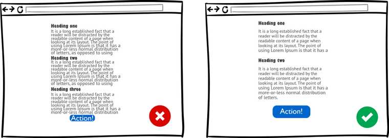
How to avoid it: Add a bit more breathing room, increase paddings and margins, make a bigger line-height for your text paragraphs.
You can utilize something called a vertical rhythm for vertical spacings of your documents. Each line takes a certain amount of space. The headings and paragraphs should fit in between these lines. If you follow this system, you’ll end up with something that looks really nice.
Don’t worry about the fact that users would have to scroll down the page, it’s quite easy for them to do.
Another great idea here can be using something like Typography.js. When using Typography.js, if you take the font size and move it up, all the spacings between elements, heading sizes, everything else adjusts proportionally, so you don’t have to do this manually in your CSS.
This gives you the ability to very quickly explore different designs while maintaining a good looking interface.
Bad typography choice
Type is a huge component of the visual system of the site.
In the past, there were no other variants than using a sans-serif font for headlines and a serif font for body text. Georgia for the paragraph text, Arial for headers - that’s how exquisite of a choice of fonts we had before.
But fortunately, the situation has drastically changed today. Google fonts offer you a ton of top-quality fonts with different font variants for free.
The browser support is much better now, and we even see new technologies like variable fonts emerging at a rapid pace.
So, there are no hard rules about when to use serifs and when not to use them. It’s all totally up to your personal aesthetic at this point.
At the same time, now we have another problem - paralysis of choice. Which font or font combination to use?
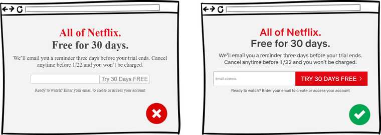
How to avoid it: If you’re not a specialist in this area, you can look up some really nice font-combinations that other people used and use them too.
Some systems may offer you typography schemes where all this was done for you and all you need is to pick one for your liking.
Toooooo wiiiiide text
If you have a wide page and your text takes the whole width, it gets too hard to read and the person actually needs to shake their head left to right to read it.
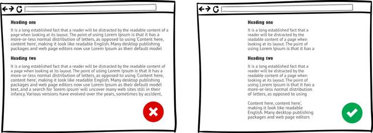
How to avoid it: Make it a little bit less wide, put in some margin or padding, add a little bit more line-height may improve the situation.
The optimal width of the line is 50-60 characters per line. So, based on how large your text is that should give you at least a little bit of guideline to figure out what’s too wide and what’s not.
True color values
Sometimes people use true colors like pure black, or pure blue, without any shades in their designs. In real life, if something is printed on paper you’re not always looking at a true color. On the screen, true colors aren’t always the best option.
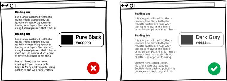
How to avoid it: For example, if you’re using true black on a white background, it might add a lot of strain to your eyes. It’s almost always better to use dark gray instead of pure black color.
Just check out the text color on any major well-designed website. It’s not going to be true black. It makes readability so much easier and not so harsh as just regular black.
Too many different colors that don’t go well together
It’s not uncommon to see a website design where you can count a million different colors on one page. In reality, you don’t need so many of them to stand out or make a point with your design.
You usually need a primary color, a secondary color, maybe a couple of variants and a couple of shades. When creating a design, you can generally start off with 3-4 colors, tweak them and build at least a prototype of the website.
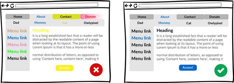
How to avoid it: If you’ve chosen your primary color, you can use a generator that will go off and generate the palette that you can then use. Then you can settle on a couple of them, to actually use for the website.
How do you know what colors go well together?
Well, if you have one brand color, then you can go to color.adobe.com or colourlovers.com and look for accents using pre-defined color harmony rules there. There’s also a triangle of complementary colors out there that can be used.
All these color generators will help you to pick up the exact values for the colors that you might not think about before.
Poor color contrast
For people with low vision and colorblindness, it’s important to have good color contrast between foreground and background of the element on the page.
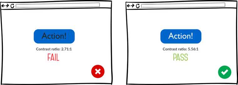
Quite recently there was an awful trend of using super light greys for text for everything. It was really bad for accessibility. You should be checking this at all times. Not everybody has a good vision and can read those light colors.
How to avoid it: You can use a tool like Color Contrast Checker to check color contrast by putting in the foreground and background color.
Also, perform an accessibility audit with the Lighthouse in Chrome Dev Tools, this will give you a list of issues that are worth fixing.
A couple of minutes of your time checking color contrast could result in a significant increase in the number of people who can read your website or application.
Using default browser UI elements
Default inputs, buttons, radios, selects usually look not very “interesting”.

How to avoid it: Styling native elements like buttons and sliders is a pain, but It’s worth giving them a little make-up lift. If it’s something that you’re not ready to do, then you should probably choose some kind of a framework.
Although default elements look not so visually appealing, they have good accessibility baked in. So, if you’re going to be creating your own buttons and other UI elements, don’t forget about making them accessible.
Aggressive animations
You probably have seen those sites where when you open the page all kinds of things start flying at you, appearing from nowhere in your face, various popups, and other fly-ins just won’t let you view the main content of the page.
This becomes a special kind of a nightmare if you’re on the slower 3G connection and use a low-end device.
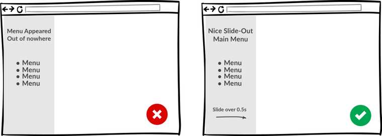
How to avoid it: You want your animations to be fairly quick, in over 0.3 sec. A lot of the time people just want to use your thing and they don’t care about the fancy animations that you have. Anything longer 0.5 sec is probably going to be too long.
Don’t use animations where they’re not necessary. Use them to give emphasis and awareness to certain elements. Keep them subtle because it can be easily abused.
How to get better at design
Now that we discussed the main problems that may appear in your designs, let’s talk about how to actually enhance your web design skills.
Let’s assume that you’re a musician who wants to improve, have a better sense of melody, rhythm and overall be better at playing music. What would you do to achieve that?
Well, first of all, listen to more good music, right? How would you even know what a good piece of music is if you’re not listening to anything more than just occasional commercial on the TV.
Familiarize yourself with some timeless classical masterpieces, dive into the world of jazz or rock if that’s more to your taste. This will train your ear and give you a good set of tools that you can then use for your own things.
The same goes for design. Put good designs in front of you a lot. Visit places like Dribble, Behance, Awwwards, Siteinspire, Codrops, follow people who specialize in design on Twitter or Instagram.
You’re going to be experiencing design that looks nice and is designed well either way. You’ll start to have an eye for good spacing, good colors and good contrast.
On sites like Dribble, you can download a website design in psd or sketch format and try to implement it by yourself. It really makes you focus on things like paddings and spacings and colors, fonts, line heights. Those are little things that you might not necessarily notice until you overlay the design on top of yours.
To get better at design you need to put time and effort into it. It all depends on how deep do you want to master this craft. If you want to be a full-on designer, it’s going to be as difficult as becoming a developer.
Final words
Hopefully, these little tips will help you improve your designs and allow you to avoid obvious mistakes. This can make such a huge difference in the way that other people perceive your project.
Have a nice day!
Also, here’s the checklist with the content from this post:
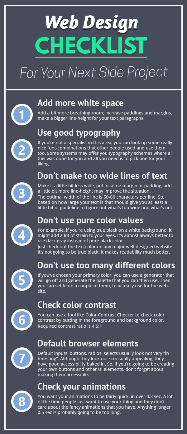
You can download it here.


