Text Reveal Animation | Step by Step Tutorial

Hey there, how are you all doing? The other day I was watching NatGeoWild and something interesting caught my eye: a lovely on screen text animation. So I thought It would be kinda cool to try to recreate it with CSS animations.
To get started we need to make sure that we have control over the playback speed of the animation.
Some of you may know that I play guitar, and sometimes when I need to transcribe a very fast or particularly tricky section of a solo I use special software to slow it down.
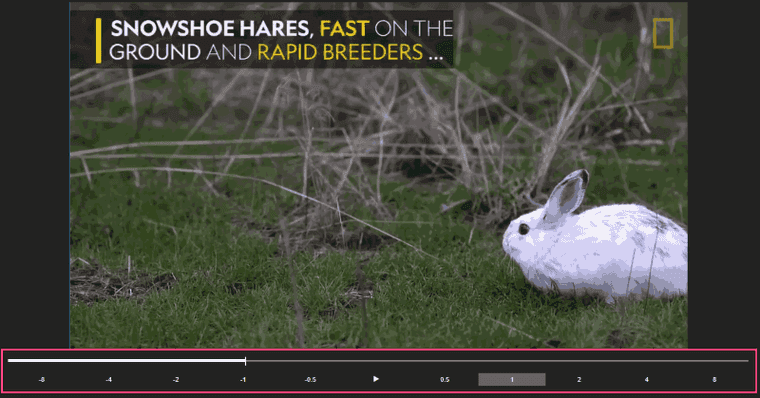
Just like with the music, to slow down animations we’ll be using our loyal assistant – GIF Scrubber.
Open GIF animation in the GIF Scrubber
Notice how we now have a timeline where we can drag the pointer and stop animation at any keyframe for detailed examination. It really makes it easy when you’re doing these kinds of CSS recreations, because you can see exactly how things are moving around at any point in time.
STEP 1. Prepare the project, fonts and basic styles
All right, we’re going to start from the basic project setup. If you’re familiar with Codepen, you can go there and create a new pen. We’re going to need only 2 files for this project – index.pug and style.scss. As you can see, I’m using Pug here. If you’re new to Pug, don’t be scared! It’s pretty quick to pick up and incredibly flexible.
Alternatively, you can clone the Text Reveal Animation repo, where you’ll see three folders with project snapshots. You can simply install assets and continue from the step you want!
So, our starter index.pug file should look like this:
doctype htmlhtml(lang="en") head title= "Owlypixel" meta(charset='utf-8') meta(name="viewport" content="width=device-width") <link href="https://fonts.googleapis.com/css?family=Open+Sans:300,400,600,700,800" rel="stylesheet"> body #app Nothing to see here, we’ve only linked our font and created a simple #app div. I’m sure they’re using another font, but for the sake of simplicity I chose Open Sans.
Now, our style.scss file will be like this:
$bg-black: #000000;$yellow: #FFCA00;
html, body {    height: 100%;    width: 100%;    margin: 0;    padding: 0;}
*, *:before, *:after {    box-sizing: border-box;}
body {    background: url(images/rabbit_bg.png);    background-size: cover;    font: 36px/1.2 'Open Sans', sans-serif;}
As you can see, we have a soft reset here, couple of variables representing colors used in this animation and a nice background with a rabbit.
STEP 2. Define the animation states
This step is easy for our animation. Since we don’t have any loaders, intermediary notification screens or anything like that, the answer for us here is 1. We only have one UI view to animate.
STEP 3. Code the final state of the animation
At first it may sound a bit counter-intuitive, but for this particular animation we’ll begin from the end. Almost every element here is transitioning between two states – invisible to visible, so it would make sense to implement everything in visible state first. The only thing that’s different for every element is how they are transitioning.
#app .ui-slide-out .text-wrapper .line #[span.black Snowshoe hares,] #[span.black.yellow fast] #[span.thin on the] .line ground #[span.thin and] #[span.yellow rapid breeders] ...The markup is pretty simple here. We have 4 main elements.
#app– top level element which has position: relative. All other elements are positioned relative to it.ui-slide-out– semi-transparent black background that slides out from the left#app:after– yellow border that grows from the middle.line– 2 lines of text, each one has it’s own font styling to highlight certain words
And here’s the styles we need so our notification would look close to the original.
#app { position: relative; &:after { display: block; content: ''; position: absolute; border-left: 10px solid $yellow; left: 1.528em; top: 50%; transform: translateY(-50%); width: 0.278em; height: 60%; }}.ui-slide-out { width: 720px; background-color: rgba($bg-black, .6); box-shadow: 0 .2em 1em rgba($bg-black, .3); color: #fff; padding: 20px 20px 20px 65px; .text-wrapper { text-transform: uppercase; padding-left: 0.556em; overflow: hidden; }}.line { span { display: inline-block; height: 43.2px; }}.yellow { color: $yellow;}.black { font-weight: 800;}.thin { font-weight: 300;}All right, now let’s get everything centered and pinned to the left. We’re going to do this with flexbox by adding 3 simple lines to the body:
body { display: flex; align-items: center; justify-content: left;}STEP 4. Add @keyframes animations
We’ve gotten a lot done! Finally, let’s implement our keyframes animations. We’ll begin from sliding-in semi-transparent background.
Add these animation properties to our .ui-slide-in element styles:
.ui-slide-in { animation: ui-slide-in-move 1.25s; animation-timing-function: cubic-bezier(.03, .98, .5, 1); transform-origin: left center;}@keyframes ui-slide-in-move { 0% {transform: scaleX(0);} 100% {transform: scaleX(100%);}}The trick here is to scale the element along the X axis. By setting transform-origin: left center and using two keyframes we achieve the sliding from the left effect.
Note that we can even omit the final keyframe, browsers are smart enough to guess the value for it.
To slow down our animation at the end we’re using cubic-bezier timing function. If you’re not familiar with cubic-bezier, Lea Verou made a Fun Cubic-bezier Playground where you can try it out and see how it works.
Next, the expanding border.
#app { &:after { transform: translateY(-50%) scaleY(0); animation: left-border-expand .8s; animation-fill-mode: forwards; transform-origin: 50% 50%; }}@keyframes left-border-expand { 100% {transform: translateY(-50%) scaleY(1);}}We use the same scaling transformation only along the Y axis. translateY(-50%) is added to make sure that our line stays centered. animation-fill-mode: forwards applies the styles of the last keyframe to the element, so our line doesn’t disappear after animation’s execution.
And finally, sliding-in text lines.
We can recreate sliding-in effect by staggering the animation of these text lines. Staggering means animating objects in delayed succession to produce fluid motion.
.line { opacity: 0; animation: word-line-slide-out .25s forwards; animation-timing-function: ease-out; @for $i from 1 through 2 { $time: ($i * .25) + .25; &:nth-child(#{$i}n) { animation-delay: #{$time}s; } }}@keyframes word-line-slide-out { 0% { transform: translateX(-10vw); opacity: 0; } 100% { transform: translateX(0vw); opacity: 1; }}The animation-delay property will help us to stagger triggering the animation of lines. To save us some time writing nth-child selectors, we use a simple SCSS loop here.
@for $i from 1 through 2 { $time: ($i * .25) + .25; &:nth-child(#{$i}n) { animation-delay: #{$time}s; }}Since we only have 2 lines to animate, the loop has only 2 iterations. By calculating $time: ($i * .25) + .25 we basically make sure that each consecutive line starts animation with the .25s interval, plus the initial .5s delay.
Don’t forget about performance!
In order to have a performant animation you only want to animate transforms and opacity.
Most expensive type of animation after that is anything to do with triggering layout (height, width, left, right, line height, font size, etc.). You should always look to avoid animating these properties because it can lead to a dropped frames and bad experience in general.
Success!
And that’s it! We’ve used some fairly simple CSS techniques to make text-reveal animation. Maybe this could have been achieved in a different or better way.. Let me know in the comments below, and if you want to learn more about how I make these animations, make sure you subscribe below.
If you’d like to get in touch, I’m @owlypixel on Twitter.
Best wishes, bye!


