How to Build a GatsbyJS Guitar-Chords-MDX Theme From Scratch
In this tutorial, we're building a GatsbyJS theme that adds the ability to create live-editable chord diagrams in MDX posts on your website. If this sounds like something that you'd like to know more about, here's the count: one...two...three...four... let's get playing!
This post is heavily based on live-streams and tutorials from Jason Lengstorf, you can follow him on Twitter for more fun and educational web development content.
Here’s what we’re going to build in this tutorial:
What should I have installed in order to follow along?
- A somewhat recent version of NodeJS
- You’ll need to install Yarn. See system-specific installation methods here
Initial setup
In order to follow along with this blog post, clone this starter repo from GitHub. It contains two branches, start and finish. Make sure that you’re on the start branch and you’re all set to go!
The starter repo contains some boilerplate Yarn workspaces setup, but if you want to go completely from scratch, I suggest you to start with the Yarn Workspaces Setup For GatsbyJS Theme Development.
A little intro
If you’re new to Gatsby themes you might be wondering, “What the heck is a theme and why should I care?”
Well, a theme is a composable Gatsby config. 😕 - “Yep, that made everything so clear, master explainer”.
Alright, I’ll try harder. You see, unlike well-known WordPress themes, a Gatsby theme can contain not only the presentation and styles but also functionality. So, theoretically, you can package up the whole site and then publish it as a Gatsby theme package.
The cool thing about themes is that you can compose them horizontally. It’s possible to install an e-commerce theme that powers your shopping cart and then install a blog theme that powers your blog, and then install some other custom theme that cooks an omelet for you in the mornings. 😜
You can install all these themes as child themes, or they can be composed into a single theme that uses three of them and overlays styling on top.
So, for the scope of this tutorial, our plan will be to create a theme where we can live-edit chord names and immediately see the preview of how to play them on the guitar neck.
This theme will also allow us to create mdx pages with chord diagrams really fast without any additional setup on the site where the theme will be installed.
Pretty cool, right?
And that’s just the icing on the top of the cake. Interested now? Ok, let’s write some code.
Pre-Bootstrap setup
When we’re developing a theme, this theme can use some data. For example, a theme can look for a folder with Markdown files and then show them on the page. So, what we need to do here is to make sure that any folders that we’re going to use exist.
But first, we’re going to install one very useful library called mkdirp that’ll allow us to recursively create directories. We’ll need this library later.
In our root folder that we got after cloning the repo gatsby-theme-guitar-chords-tutorial, run the following command:
yarn workspace gatsby-theme-guitar-chords add mkdirpDefault theme options
Once we’ve installed that, we’ll need to make a utility function that will give us default options for the theme.
In our theme folder gatsby-theme-guitar-chords create the directory utils and inside of it create a file default-theme-options.js with the following:
module.exports = ({ basePath = '/', contentPath = 'content', useExternalMDX = false}) => ({basePath, contentPath, useExternalMDX});Here we’re exporting a function that returns the default options for our theme.
basePath- URL, this means that we’ll be creating pages at the root of our sitecontentPath- this is where our content will liveuseExternalMDX- by default we’ll assume that the site is not using MDX, and we’ll need to install it
Creating the content folder
Next, in our theme folder gatsby-theme-guitar-chords create a file gatsby-node.js with the following contents:
const path = require('path');const fs = require('fs');const mkdirp = require('mkdirp');const withDefaults = require('./utils/default-theme-options');
exports.onPreBootstrap = ({ store }, options) => {  const { program } = store.getState()  const { contentPath } = withDefaults(options)  const dir = path.join(program.directory, contentPath)  if (!fs.existsSync(dir)){    mkdirp.sync(dir);  }}
Using that file, we can hook up into Gatsby lifecycle methods during the build and do a lot of interesting things. Let’s look at what we have here.
At the top, we’re importing necessary built-in Node libraries and our default theme options.
Following that we’re using Gatsby API hook called onPreBootstrap to check if the content directory exists and if not we’ll create it. This will help us to avoid the filesystem plugin to fail because of a missing directory.
Note: onPreBootstrap API hook is called once Gatsby has initialized itself and is ready to bootstrap your site.
store gives us access to the information about the running program and the second argument there is the theme options. Out of the store we get a program which gives us consistent information about our app no matter in what environment we are.
We’re taking options from the user and extracting the one piece that we’re going to use.
Next, we need to find where we’re located and append a content path. To do this we’re using a built-in Node modules fs and mkdirp that we installed earlier. The mkdirp library allows recursive creation of subdirectories.
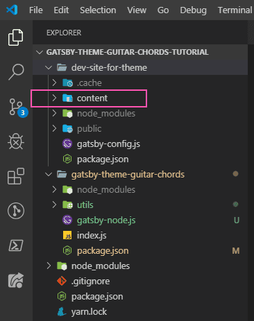
So, basically, at this step we’ve created our folder on the file system where our Markdown files should exist.
To test that everything works, let’s start the site in develop mode.
yarn workspace dev-site-for-theme develop After doing that you should see that our content folder was created.
Loading MDX files
So, the next thing that we’re going to do is to actually load our mdx files.
Note: MDX is an authorable format that lets you seamlessly write JSX in your Markdown documents. You can import components, such as interactive charts or alerts, and embed them within your content. MDX is basically a Markdown with JSX.
In our content folder create an index.mdx file with the following content:
---title: This is our home page---Welcome to our newly created home page!The area marked with triple dashes is called a Frontmatter, and it’s the place where we can put some meta-information about our page. We write frontmatter using YAML syntax.
Below frontmatter we have a body of the page and upon saving that we have a completely valid mdx file that we can use however we want.
Adding source plugins
To load this file in our theme we’ll need to install a couple of plugins.
yarn workspace gatsby-theme-guitar-chords add gatsby-source-filesystem gatsby-plugin-mdx @mdx-js/mdx @mdx-js/reactNote: gatsby-source-filesystem allows us to use a folder in the project as a data source.
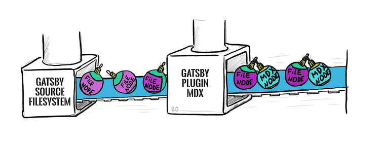
- gatsby-source-filesystem will grab files from the specified directory and put them into the GraphQL layer so that we can use them.
- gatsby-plugin-mdx is going to convert all
.mdxfiles into GraphQL nodes, which means that we’ll be able to get their content.
How this works:
gatsby-source-filesystemcreatesfilenodes. After that,gatsby-plugin-mdxcreates childmdxnodes out of them, but we still have access to the parentfilenodes.
The rest of the plugins that we installed is just a dependencies needed for gatsby-plugin-mdx.
Setting up configs
Now that we’ve installed necessary plugins we need to get them configured in our gatsby-config.js for the theme.
In our gatsby-theme-guitar-chords folder, next to gatsby-node.js file create a gatsby-config.js file.
const withDefaults = require('./utils/default-theme-options')
module.exports = options => {  const { contentPath, useExternalMDX } = withDefaults(options)
  return {    plugins: [      {        resolve: 'gatsby-source-filesystem',        options: {          name: 'gatsby-theme-guitar-chords',          path: contentPath        }      },      !useExternalMDX && {        resolve: 'gatsby-plugin-mdx',        options: {          defaultLayouts: {            default: require.resolve('./src/components/layout.js'),
          }        }      }    ].filter(Boolean)  }}
At the top, we’re importing our default options.
Usually, configs are written as simple objects, but since we’re in a theme, it becomes a function that receives those default options.
Next, we’re using contentPath again, because we need to show the filesystem module where to look for the files.
useExternalMDX is telling us whether or not to load our mdx plugin in the theme.
After that, we return the plugins array. In Gatsby, if a plugin has options we need to specify this plugin as an object with the resolve and options keys, instead of a simple string.
For gatsby-source-filesystem plugin in the options, we use the name key to be able to identify which files were loaded by our theme. We don’t want to do anything with all other files that may be used by some other theme and grab files strictly from our specified content path.
So, this will give us files that we want in our file system from the specified path.
For gatsby-plugin-mdx plugin if the boolean useExternalMDX is set to true, we’re going to just skip ahead. Otherwise, we specify the default layout which we’ll create down below.
Next, we’re wrapping our mdx files in this wrapper component that we’ll create in the specified folder.
And, finally, we’re filtering our plugins array so that it drops any false values.
Ok, now in our theme create the layout file with the following path: /src/components/layout.js
import React from 'react'
const Layout = ({ children }) => (  <>    <header>Gatsby-theme-guitar-chords</header>    <main>{children}</main>  </>)
export default Layout
Here we’re importing React, but we’ve never installed it in our theme. That’s because it will be available from our development site.
Following that, we’re creating a Layout component that receives children as the content of markdown files.
Then we’re basically returning our theme name and children wrapped in a header and main tags.
Now it’s time to check that everything is ok.
yarn workspace dev-site-for-theme develop If everything went well, you should see a 404 development page as before. It’s not currently showing anything because we’ve only added the information from our file to the GraphQL layer.
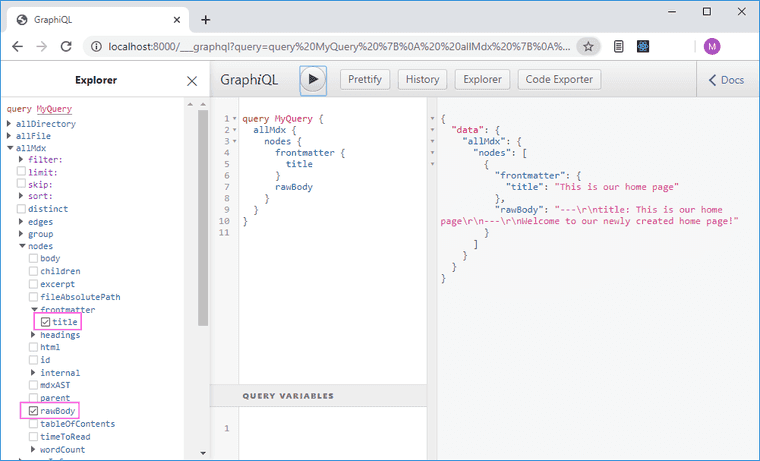
Now we can explore all available data in the GraphQL explorer. Navigate to the http://localhost:8000/___graphql in your browser and you’ll see some interesting things available for querying. We can now query AllDirectory, AllFile, AllMdx and other things.
Just to try things out, select AllMdx/nodes/frontmatter/title and AllMdx/nodes/rawBody and click the play button at the top - you’ll see the result of the query in the right pane.
Schema customization
To be able to easily get things like title, body out of our mdx, we need to use Schema customization API.
In our theme’s gatsby-node.js file at the bottom add the following:
exports.createSchemaCustomization = ({ node, actions, getNode, createNodeId }, options) => { actions.createTypes(` type ChordsPage implements Node @dontInfer { id: ID! title: String! path: String! updated: Date! @dateformat body: String! } `)}Here, we use createSchemaCustomization API, which gives us a lot of data:
- node - it’s the actual node that we then can extend and modify as we wish
- actions - object of available actions that we can take
- getNode - a helper that gets a particular node
- createNodeId - a helper to create a node id
The only action that we’ll need is the createTypes action. Here we’re basically defining that some new entity will exist in Gatsby’s GraphQL layer.
So, we’re creating a new type called ChordsPage and we want it to be queryable, so we need it to implement a Node type, which is a core type in Gatsby. By defining that something is a node we’re getting some very useful stuff like querying, filtering and other stuff.
By adding @dontInfer we’re telling it not to add any other fields except the fields that we specified.
Next, we’re adding fields to our type: id, title, path, updated and body. They have types of ID, String, Date and the exclamation point means that they’re required.
To properly format the date we use a @dateformat helper.
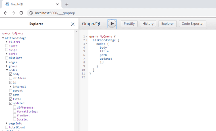
After that, start the server again and in GraphQL explorer you’ll see that we now can query chords pages. And if we look inside of it we’ll see all our fields available for querying.
Of course there’s no any data if we try to run queries on these fields, but Gatsby now knows that this type exists and this is exactly what we wanted.
Creating ChordsPage nodes
Once we’ve defined a type, we now need to actually create the ChordsPage nodes. We’ll do it by catching every mdx node that gets created and creating a ChordsPage node out of it.
For this, we’ll use another API hook called onCreateNode. In our theme’s gatsby-node.js file at the bottom add the following:
exports.onCreateNode = ({ node, actions, getNode, createNodeId}, options) => {  const { basePath } = withDefaults(options);  const parent = getNode(node.parent);  if (    node.internal.type !== 'Mdx' ||     parent.sourceInstanceName !== 'gatsby-theme-guitar-chords'  ) {    return  }
  const pageName = parent.name != 'index' ? parent.name : '';
  actions.createNode({    id: createNodeId(`ChordsPage-${node.id}`),    title: node.frontmatter.title || parent.name,    updated: parent.modifiedTime,    path: urlResolve(basePath, parent.relativeDirectory, pageName),    parent: node.id,    internal: {      type: 'ChordsPage',      contentDigest: node.internal.contentDigest,    }  })}
Here we first get our basePath to build the pages later and then we’re catching a parent node.
As mentioned earlier, gatsby-source-filesystem creates file nodes. After that, gatsby-plugin-mdx creates child mdx nodes out of them. When we’re catching those mdx nodes we still have access to the parent file node out of which we can get the name (we set this name in the gatsby-source-filesystem plugin options).
We’re doing all this because we want to make sure that we work only with the files that were loaded by our theme.
Next, we’re checking if the node type is not mdx or the name is not gatsby-theme-chords, and if it’s true, we’re making an early return.
After that, we’re setting the index page behavior by ignoring the file name if we’re on the index page.
Next, we’re actually creating a node using createNode action. This action accepts a new node object. For this object we need to provide:
- id - this is just a unique id for our node. We can make it even more unique by prefixing it with the type name.
- title - we take out title here from the frontmatter with the fallback to the parent name.
- updated - this one we can take straight from the parent.
- path - here we’re stitching together base path, directory path from the parent and the page name with the help of
urlResolvehelper fromgatsby-core-utils(don’t forget to add it’s import at the top of the file).
const { urlResolve } = require(`gatsby-core-utils`)Another variant here would be to use path.join function, but when using that I faced the fact that URLs stop working if you’re on Windows. Ohhh.. OS inconsistencies…
- parent - we set
node.idof themdxnode as the parent of ourChordsPagenode so we can reference it later in our resolver. - internal - every Gatsby node needs to have this
internalproperty.- type - we’re going to set up the
ChordPagefor type here. This can be anything, it just needs to be unique. - contentDigest - after that we’re specifying the
contentDigestwhich is like a hash of the node content to help Gatsby decide whether or not it should rebuild that node. Here we can take ourcontentDigeststraight frommdxnode.
- type - we’re going to set up the
Finding the body
You probably noticed that we’re not including body here. That’s because not all of the node types fully resolve by the time we get to onCreateNode. That creates a challenge for us.
If we want to get the mdx body we can’t just call it here because it’s not set yet.
This means that we have to create a custom resolver. At the bottom of our gatsby-node.js file add the following:
exports.createResolvers = ({ createResolvers }) => {  createResolvers({    ChordsPage: {      body: {        type: 'String!',        resolve: (source, args, context, info) => {          const type = info.schema.getType('Mdx');          const mdxFields = type.getFields();          const resolver = mdxFields.body.resolve;
          const mdxNode = context.nodeModel.getNodeById({ id: source.parent});
          return resolver(mdxNode, args, context, {            fieldName: 'body',          });
        }      }    }  })}
Here we’re using the createResolvers hook, which gives us a function called createResolvers, where we get into a ChordsPage type and set up a body resolver.
For our body resolver, we need to specify the type, which as we’ve declared earlier is a String, and a resolver function.
The resolver function gets 4 arguments:
- source - the node itself
- args - arguments passed to that node
- context - some information about the request or the node
- info - general information about the GraphQL schema
So, here we’ve created a pass-through resolver by first, pulling a type out of Gatsby schema definition for mdx nodes, then loading all of the fields from that type, and finally getting the resolver for our body field.
The request to our ChordsPage body type will behave in the same way as the request for the mdx node request to the body type (that’s why we’re calling it pass-through resolver).
Once we have the resolver, we get the mdx node as the parent of our ChordsPage node and, finally, resolve our body field.
Now, effectively we’re getting all data (mdx, frontmatter, file system) all in one simple node API.
Since we’ve modified the way that nodes work, we need to run the clean command:
yarn workspace dev-site-for-theme gatsby cleanAnd after that, start our development server again with the new GraphQL layer in place.
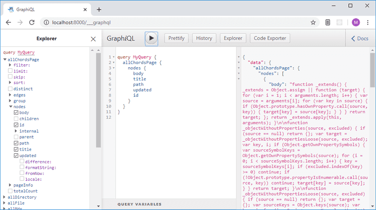
yarn workspace dev-site-for-theme develop Now we’ve got custom data that we need showing up in GraphQL explorer:
Defining page templates
Whenever we create our page programmatically in Gatsby, it’s a good idea to put the page template in a separate directory.
In our theme’s folder gatsby-theme-guitar-chords create a page template: gatsby-theme-guitar-chords/src/templates/chords-page-template.js with the following content:
import React from 'react'import { graphql } from 'gatsby'import ChordsPage from '../components/chords-page'
export const query = graphql`  query ($pageID: String!) {    chordsPage(id: {eq: $pageID}) {      title      updated(fromNow: true)      body    }  }`
const ChordsPageTemplate = ({ data }) => <ChordsPage page={data.chordsPage} />
export default ChordsPageTemplate;
This page template is going to load the data via GraphQL query and pass it to a component, which is going to display it. We want to be sure that we’re separating sourcing of the data from the display of the data here, that’s why we’ll have 2 separate files.
So, here we’re exporting a page query, which loads the page by id that gets passed to it from the context in the createPage API (we’ll look at that later).
Note: This query runs only as the part of the page creation process by Gatsby in the
createPagesAPI hook.
During the build, Gatsby looks at all exported queries, executes them, gets the data and then injects that data as the data prop into the component. That’s why we now have the ability to pass this data to the component that will display it. Let’s create that component now.
Create a file gatsby-theme-chords-page/src/components/chords-page.js with the following:
import React from 'react';import { MDXRenderer } from 'gatsby-plugin-mdx';import Layout from './layout';
const ChordsPage = ({ page }) => (  <Layout>    <h1>{page.title}</h1>    <MDXRenderer>{page.body}</MDXRenderer>    <p>This page was updated {page.updated}</p>  </Layout>)
export default ChordsPage
Here we’re importing an MDXRenderer that is used to render mdx code into a readable format. We’re creating a ChordsPage component that uses our layout and renders our data on the page.
Using page templates to create pages
Now that we’ve defined our templates, it’s time to actually use them. In our theme’s gatsby-node.js file at the bottom add the following:
exports.createPages = async ({ actions, graphql, reporter }) => {  const result = await graphql(`    query{      allChordsPage{        nodes{          id          path        }      }    }  `)
  if( result.errors){    reporter.panic('error loading chords', result.errors);  }
  const pages = result.data.allChordsPage.nodes;
  pages.forEach(page => {    actions.createPage({      path: page.path,      component: require.resolve('./src/templates/chords-page-template.js'),      context: {        pageID:  page.id,      }    })  })}
We’re using Gatsby’s workhorse API called createPages. Since we’re requesting data here, we need to mark our createPages function as async.
CreatePages API gives us:
- actions - an object that contains a number of useful helper functions
- graphql - a function to get some data
- reporter - a reporter function to log things to the console
So, here we start by requesting the id, which we need to pass the context, and a path, which we’ll use as a definition of a URL.
Note: In the
createPagesAPI graphql is a function and not a template tag. You should keep that in mind.
Following that, we do a quick check for errors and if there are any, we log them to the console.
Next, we’re taking our pages, looping through them and for each page we’re running an action called createPage, which accepts an object with fields:
- path - our path that we’ve defined before
- component - the template that we’ve defined earlier
- context - an arbitrary object where we pass our page
id. This will become available as a GraphQL variable in the template
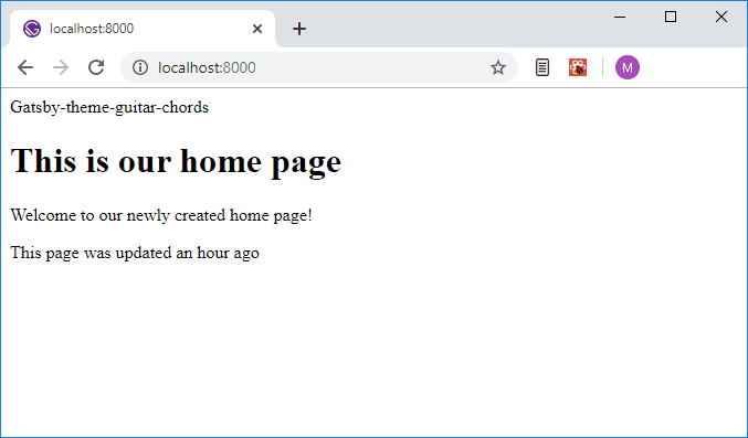
Now if we restart the development server, we’ll finally see the contents of our page on the screen.
Setting up syntax highlighting
Alright, let’s set up syntax highlighting in our mdx files. For this we’ll need to install a couple more dependencies:
yarn workspace gatsby-theme-guitar-chords add prism-react-renderer mdx-utilsNext, in our theme create a component gatsby-theme-guitar-chords/src/components/code.js with the following:
import React from 'react'import { preToCodeBlock } from 'mdx-utils';import Highlight, { defaultProps } from 'prism-react-renderer';import theme from 'prism-react-renderer/themes/nightOwl';
const Code = props => {  const codeProps = preToCodeBlock(props);
  if(!codeProps) {    return <pre {...props} />  }
  const {codeString, language} = codeProps;
  return (    <Highlight      {...defaultProps}      code={codeString}      language={language}      theme={theme}    >      {({ className, style, tokens, getLineProps, getTokenProps}) => (        <pre          className={className}          style={style}        >          {tokens.map((line, i) => (            <div {...getLineProps({line, key: i})}>              {line.map((token, key) => (                <span { ...getTokenProps({token, key})} />              ))}            </div>          ))}        </pre>      )}    </Highlight>  ) }
export default Code
After importing all necessary modules, we’re creating a component called Code.
In this component, we’re using preToCodeBlock that will allow us to get props out of <pre> element, such as the language, code string, etc.
If we didn’t get any props, that says to us that this code block isn’t highlightable and we simply return <pre> tag with props.
If we do have code props, we pull them out, return a Highlight component and pass it some default props - codeString and language.
The Highlight component uses RenderProps pattern, which means that we get a function and inside we’re basically letting the highlighter do its job. It takes the code block, breaks it up into different tokens and does all bunch of stuff. I’m not going to go into details here since it’s a bit out of the scope for this tutorial.
Components override
Next, we need to specify which component will be used to override specific HTML elements that Markdown compiles to. In out theme’s layout.js file import our Code component and MDXProvider, then wrap our app in it like so:
import React from 'react'import { MDXProvider } from '@mdx-js/react'import Code from '../components/code'
const components = {  pre: Code}
const Layout = ({ children }) => (  <>    <MDXProvider components={components}>      <header>Gatsby-theme-guitar-chords</header>      <main>{children}</main>    </MDXProvider>  </>)
export default Layout
The components object is a mapping between the HTML name and the desired component we’d like to render.
Now we can try how it works. Open our index.mdx file and add the following code block at the bottom there:
```javascriptimport Code from '../components/code'
export default Code.``````this is a text without code highlighting```
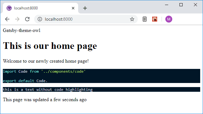
Once you start your development server again, you’ll see that the first block is now highlighted and the second one is not. This is just what we want! Great.
And finally, here comes the most interesting part of this tutorial - making live editable highlighted code block.
Setting up a live editable preview
This will allow us to type the chord name and see the fingering diagram preview. This is a really good way to try out and experiment with different types of chords. For this, we’re going to be using react-live and react-guitar-chord. Go ahead and install them:
yarn workspace gatsby-theme-guitar-chords add react-live react-guitar-chordOnce that installed, open our code.js file and add the selected code there:
import React from 'react'import { preToCodeBlock } from 'mdx-utils';import Highlight, { defaultProps } from 'prism-react-renderer';import theme from 'prism-react-renderer/themes/nightOwl';import { LiveProvider, LiveEditor, LiveError, LivePreview } from 'react-live';import scope from '../scope';

const Code = props => {  const codeProps = preToCodeBlock(props);
  if(!codeProps) {    return <pre {...props} />  }
  const {codeString, language} = codeProps;
  return codeProps['react-live'] ? (    <LiveProvider code={codeString} scope={scope} theme={theme}>      <LiveEditor />      <LiveError />      <LivePreview />    </LiveProvider>  ) : (    <Highlight      {...defaultProps}      code={codeString}      language={language}      theme={theme}    >      {({ className, style, tokens, getLineProps, getTokenProps}) => (        <pre          className={className}          style={style}        >          {tokens.map((line, i) => (            <div {...getLineProps({line, key: i})}>              {line.map((token, key) => (                <span { ...getTokenProps({token, key})} />              ))}            </div>          ))}        </pre>      )}    </Highlight>  ) }
export default Code
Alright, a couple of words about how this works. react-live takes our code and transpiles it with Bublé. The transpiled code is then rendered in the preview component LivePreview.
We’ve added a check whether or not our field has an attribute react-live and depending on the result show or don’t show the LivePreview area.
So, basically we have 3 possible output variants here:
- if we don’t specify any language it’ll show a regular
<pre>tag - if we don’t mark it as live editable, it’ll output highlighted code using
prism-react-renderer - if it is marked with
react-liveit’ll show aLiveProvider
You may notice that at the top we’re importing scope file. That’s because react-live will allow us to use different components in the scope. That way we don’t have to import them anytime that we use them.
Since this is a Gatsby theme, we’re going to need to create a scope file at the src root. In that way, it’ll be easy to override.
Create a file gatsby-theme-guitar-chords/src/scope.js with the following content:
import GuitarChord from 'react-guitar-chord'
export default {  GuitarChord};
Ok, it’s time to add a live-editable chord block. In our index.mdx file at the bottom add the following:
```jsx react-live() => ( <div> <h2>A chord diagram!</h2> <GuitarChord chord={'C'} /> </div>)```Just as an example here we’re exporting a simple component, which has a <GuitarChord/> component in it. Now if we restart our development server again, we should see not only a syntax-highlighted code block but a working live preview.
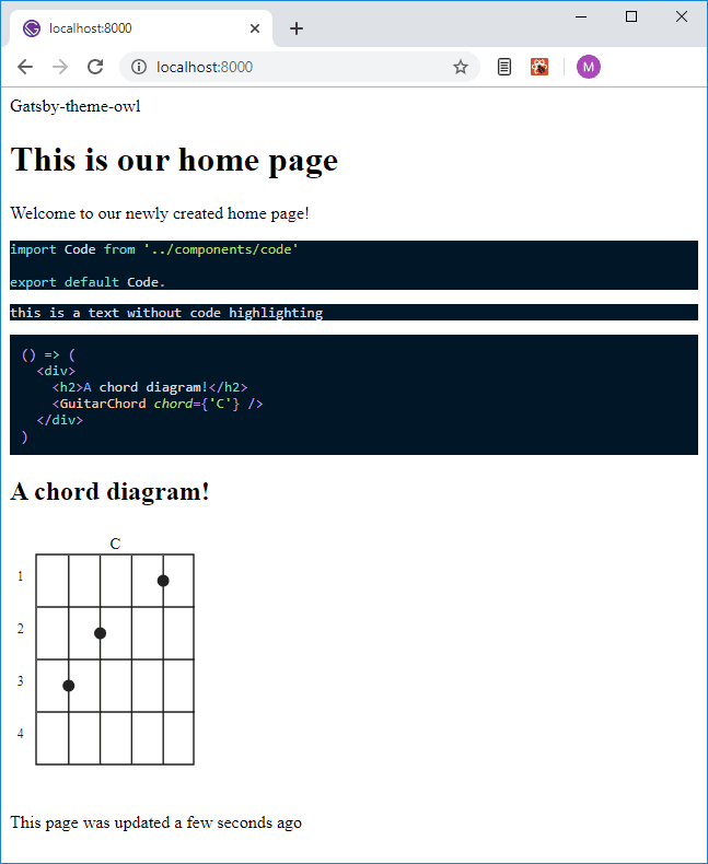
Go ahead and try to edit the name of the chord to something different, D for example, or add another chord with different quality:
```jsx react-live() => ( <div> <h2>A chord diagram!</h2> <GuitarChord chord={'C'} /> <GuitarChord chord={'D'} quality={'MIN'} /> </div>)```Final words
So, here we go, we’ve got ourselves working, live-editable chord diagrams with previews. Isn’t it great? And because we’ve created it as a theme, it’s going to work when you install this on some other Gatsby site. Anyone who wants to check this theme out will be able to install it and learn different guitar chords on the /chords page of their site.
Of course, there are some things that can be done to make this theme even better, like adding Theme UI support and making our theme look prettier, but, I guess we’ll save that for another blog post since this one is already pretty long, so stay tuned!
Thanks for reading and I hope you enjoyed it! I’ll go grab myself some apple juice. See yall in my next blog post.
Cheers!


